Create webform
Webform is the module for making forms and surveys in Drupal. After a submission customizable e-mails can be sent to administrators and/or submitters. Results can be exported into Excel or other spreadsheet applications.
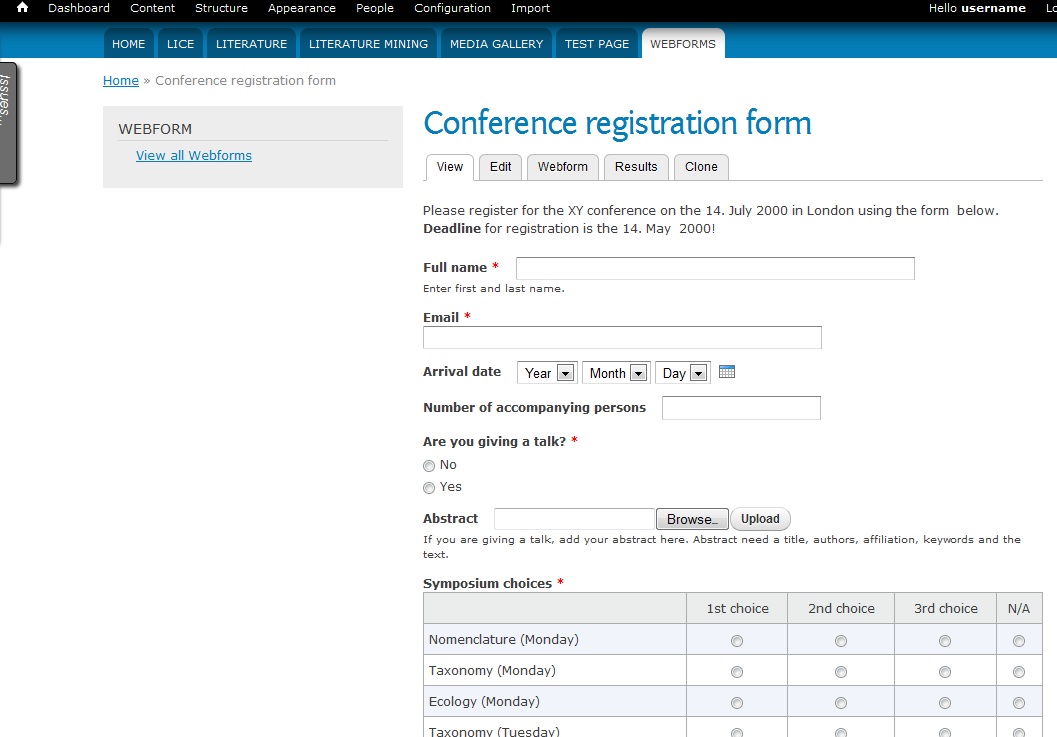
In this example, we will create a webform for a conference registration. People can fill in the form without having to register or log in to the Scratchpad site.
Enable the webform module
- In the Admin menu go to Structure > Tools
- In the ‘Webform’ section turn Webforms on and save.
Create a webform
In the Admin menu go to Content
Next to Webform, click Add
Create a webform
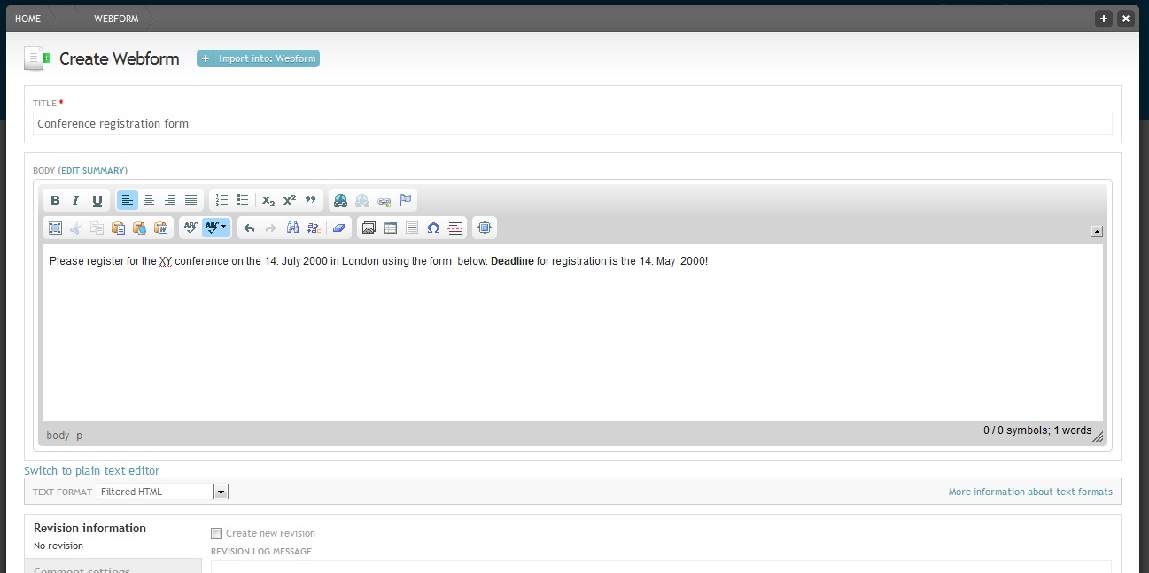
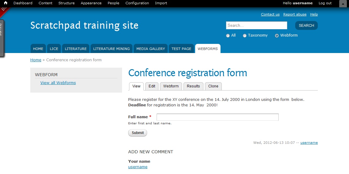
Enter a TITLE and some BODY text. The body text will appear at the top of the form and can be used for an introduction.
Save. Now we can enter fields to your form.
Add webform components
Components is the webform terminology for fields. To start adding components start editing a webform, and select the Webform tab.
This opens the webform components interface:
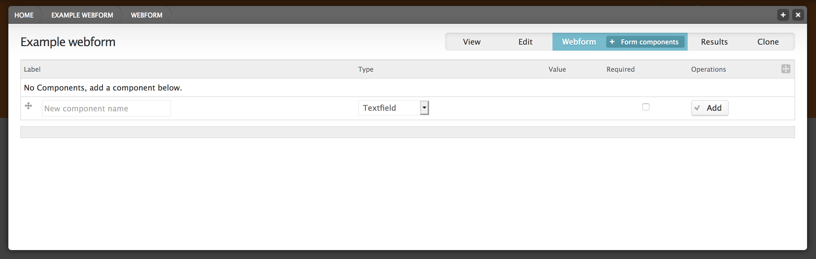
Select the type of field you want (Text field, Date field, Number field, Select option field, File field, Grid field, Text area field, Private field) and click Add
Text field
Components of the type “Textfield” are for entering short text that is up to 255 characters long. Add a component for entering the full name.
Add “Full name” as the new component name and select the “Textfield” type. Check “Mandatory”. Mandatory means that the user has to fill in this field before he can submit the form. Click the button.
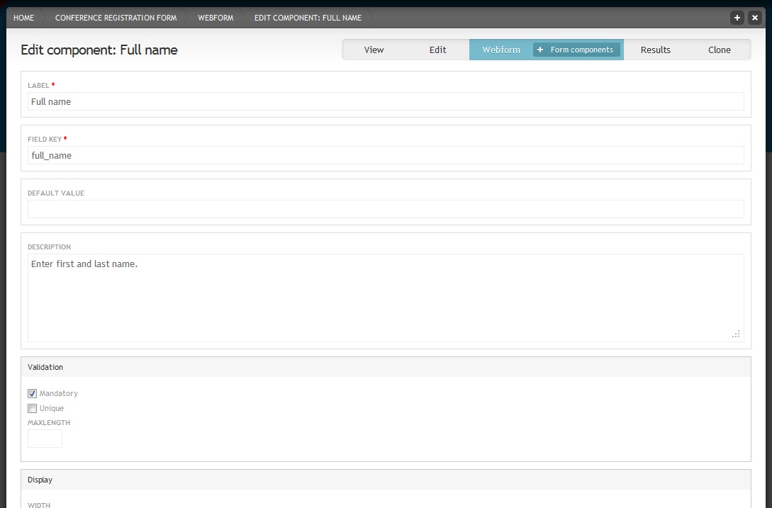
Webform component settings
Under ‘DESCRIPTION’ add a short instructions that help users in filling in this field.
In the ‘Display’ section you have several options for changing the display. For example if you add a field asking for the size of a poster, you could add “cm” in the ‘LABEL PLACED TO THE RIGHT OF THE TEXTFIELD’ field, so that users know to give the size in centimetres. By default the label is placed above the field. To save space select “Inline” as ‘LABEL DISPLAY’. For our “Full name” example component just select “Inline” display and none of the other display options. Save component.
Webform with introduction and one component
Click on the tab to check how your webform looks so far. Then click on the tab to add more components.
Email field
- Add “Email” as the new component name and select the “E-mail” type. Check “Mandatory”. Click the button. Save.
Date field
- Add “Arrival date” as the new component name and select the “Date” type. Enter “2000-05-29” as ‘START DATE’. Enable the pop-up calendar and choose “inline” for the label display. Save.
Number field
- Add “Number of accompanying persons” as the new component name and select the “Number” type. Add. Check “Integer” in the ‘Validation’ section. Choose “inline” for the label display. Save.
Select option field
- Add “Are you giving a talk?” as the new component name and select the “Select options” type. Check “Mandatory”. Add. Enter “1|No” and “2|Yes” in the ‘OPTIONS’ field in two lines. The ‘OPTIONS’ field uses safe keys. Safe keys ensure that each options is saved individually. For example if you publish a webform and at a later stage decide to change the wording of one of the options, you would only change the readable option, not the save key. That way the system recognises that this is still the same option and this will help you later when you evaluate the results. The safe key is always on the left side and separated from the readable option by a pipe character. Save.
File field
- Add “Abstract” as the new component name and select the “File” type. Click the button. Add some instructions on what the abstract should contain in the ‘DESCRIPTION’ field. In the ‘UPLOAD DESTINATION’ section check “Private files” so that only user that have the right to view submissions can view the abstracts. Under ‘ALLOWED FILE EXTENTIONS’ unselect the web images extensions and choose several documents extensions instead. Save.
Grid field
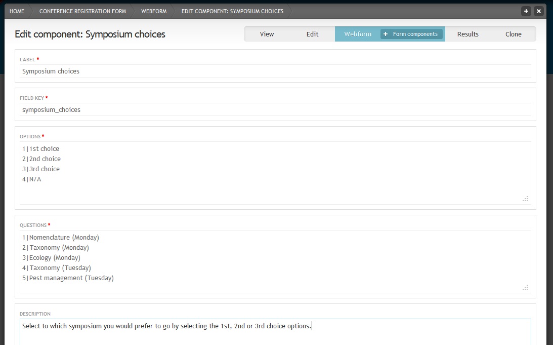
Grid fields allow the user to select different choices for a set of questions. Grids are often used in questionnaires to for example state how good something is on a scale from 1 to 5. For our conference registration webform we will assume that participants numbers for symposia are restricted add a grid in which users can state how important the attendance at specific symposia is for them.
Add “Symposium choices” as the new component name and select the “Grid” type. Check “Mandatory”. Click the button.
Webform component settings for Grid fields
Add some options as well as the questions (both with safe keys) and a description. Save.
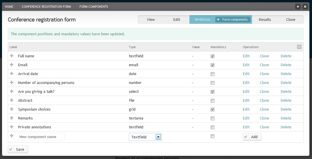
Webform administration page with various form components
Text area field
Text area fields are for longer text.
- Add “Remarks” as the new component name and select the “Textarea” type. Click the button.
Private field
If you want to annotate the forms that users have submitted without having the annotation field showing up in the webform, check “Private” at the bottom of the component settings page.
- Add “Private annotations” as the new component name and select the “Textfield” type. Click the button. Check “Private”. Save.
- Click on the tab to have a look at your webform. For long forms you can add page breaks if needed. Log out of your Scratchpad and go to the webform page. You will notice that the “Private annotations” field is now hidden.
The webform is ready to to be used so lets setup a way to monitor responses and analyse the results - see Administer webforms.